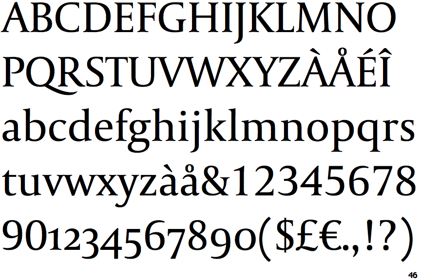

Though the original Capitolium worked well in most modern production processes and on screens, its original wayfinding purpose meant it was too fragile for the more stringent requirements of newsprint: sturdier shapes, a taller x-height, and more characters per line of text.


Soon after the completion of this project, Dr Unger began contemplating the possibility of bringing this design to newspapers. It is a modern typeface for the 21st century that is strongly related to the traditions of Rome. Capitolium also continued Rome’s almost uninterrupted 2,000 year old tradition of public lettering. This type design was the central part of the project for a wayfinding and information system to guide pilgrims and tourists through Rome. The Capitolium font family was designed by Dr Gerard Unger in 1998 at the request of the Agenzia Romana per la Preparatione del Giubileo for the Jubilee of the Roman Catholic Church in 2000.


 0 kommentar(er)
